
Brand system / Edition 01
Consistency,
with character.
A practical reference for keeping every X Studio touchpoint part of the same story.
01 / The signature
Give the X space.
Use the supplied artwork. Preserve its proportions and keep a generous clear area around the full signature.


Keep it clear.
Place the full logo on calm, high-contrast backgrounds. At small sizes, ensure “Studio” remains readable.
Keep it intact.
Do not stretch, redraw, rotate or add effects. Avoid placing the signature over visually busy photography.
Keep it restrained.
Use the X as a recognizable signature. Avoid repeating it as a decorative pattern across every surface.
These SVG downloads faithfully trace the supplied artwork, including the fine lettering. They contain vector paths only, with transparent backgrounds. The original PNG files remain available for reference.
02 / Color
Contrast leads.
Warmth supports.
Black and off-white create the rhythm. Warm neutrals are accents. Photography brings the color.
Select a swatch to copy its HEX value.
Use dark text on light surfaces and light text on dark surfaces. Check contrast for small text; accent colors do not automatically make accessible text combinations.
03 / Typography
Editorial.
Not ornamental.
Playfair Display gives the headlines their voice. Inter keeps navigation, details and practical information clear.
Playfair Display / Headlines
AaCreate. Capture. Elevate.
ABCDEFGHIJKLMNOPQRSTUVWXYZ
abcdefghijklmnopqrstuvwxyz
0123456789
Inter / Supporting typography
AaA space for your ideas.
A team for your vision.
ABCDEFGHIJKLMNOPQRSTUVWXYZ
abcdefghijklmnopqrstuvwxyz
0123456789
Hierarchy
Large serif headings, concise supporting copy, small tracked labels. One clear visual priority at a time.
Readability
Use at least 16px for main body copy. Keep long lines contained and leave comfortable space between paragraphs.
Rhythm
Use fluid headings and generous gutters. On mobile, recompose the page rather than shrinking a desktop layout.
04 / Photography
Let the work
take the lead.
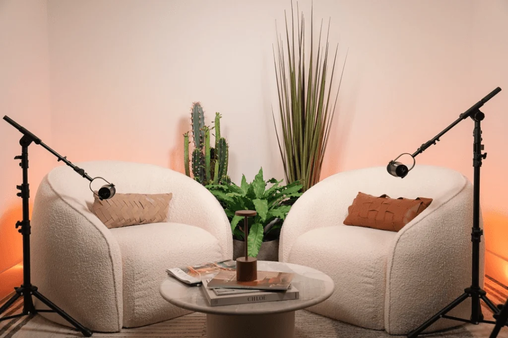
Authentic studio work, considered light and a clear subject. Give each image a reason to be on the page.


Light & color
Preserve skin tones, controlled contrast and detail in shadows. Avoid applying one heavy filter to every photograph.
Composition
Mix full frames and close details. Protect faces and important gestures when adapting crops for mobile.
Authenticity
Use approved portfolio images. Never present stock or generated imagery as client work, and do not invent testimonials.
05 / Voice & interface
Say it clearly.
Confident, refined and conversational. Specific details are more useful than grand promises.
Use
“Your brand,
in the right light.”
Direct language. Short ideas. A clear connection to the service.
Avoid
“Unlock limitless
creative potential.”
Vague claims, inflated language and phrases that could describe any company.
Keep actions rectangular, labels concise and focus states visible. Use subtle motion and respect reduced-motion preferences.
06 / Brand resources
Ready to work with.
Transparent vector logos and written guidelines for collaborators working on X Studio Miami materials.
White signature
Download SVG ↓SVG / LightBlack signature
Download SVG ↓MarkdownDesign guidelines
Download guide ↓MarkdownVoice & content
Download guide ↓Use these materials for X Studio Miami communications. Preserve the official artwork and approved photographic content.